OAS and Grafana Integration
Grafana is a dashboard system for visualizing data in a web browser. With a variety of plugins for various data sources, it makes a great complement to the OAS Data Historian. In this tutorial we’ll follow the steps necessary to display data logged to a MS SQL Server database, updated at an interval. Next we’ll pick out individual data points to use as gauges on the dashboard. And then finally we’ll discuss using Grafana to display custom HMIs developed with the OAS Web HMI, Web Alarm, and Web Trend products.
NOTE: If you want to visualize your data in a desktop or mobile browser with zero programming, you may be interested in the OAS Open UIEngine .
The UIEngine is a robust no-code web application and HMI builder for developing rich user interfaces in a browser-based development environment.
See the UIEngine Documentation to learn more.
Prerequisites:
- An instance of the OAS Server
Download and install OAS, either on Windows or Linux - A running database where OAS can log data. In this tutorial we will use a local instance of Microsoft SQL Server.
We’ll cover the data logging configuration below. - A local instance of Grafana or an account with Grafana Cloud
Grafana Cloud will need to communicate with your database and this can sometimes be difficult to configure through firewalls and network addressing, so for this tutorial we will use a local instance of Grafana to simplify the communications. You can download a self-hosted version of Grafana here (https://grafana.com/get/?plcmt=top-nav&cta=downloads)
Step 1: Set Up Data Logging
Once your OAS instance is up and running, we’ll add a data logging group to log three Tag values (Ramp, Random, and Sine) at a one second interval. The following screenshots display the necessary configuration. We’ll log to a Database called DemoLog and a table called LogData.
To do this we’ll select Configure-Data Logging in the Configure OAS application. For more information on Data Logging visit the Getting Started – Data Logging guide.
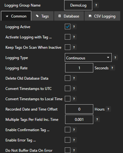
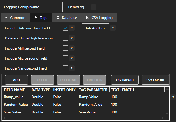
The tags we’ll be logging are Sine, Ramp, and Random, and we’ll be including a timestamp field called DateAndTime, as you can see from this screenshot:
Once data logging has been enabled, open up SQL Management Studio to confirm your database has been created and OAS is logging the data.
Step 2: Connect Data Source in Grafana
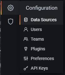
In your browser, open up Grafana and log in. Then select Configuration > Data Sources to connect to your database.
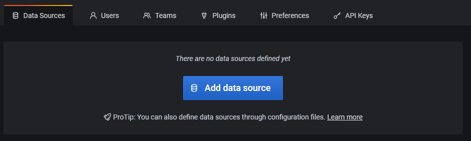
Click Add Data Source and then select Microsoft SQL Server under the list of SQL data sources. This will bring up the configuration options for the connection. As you can see here, I’ve selected localhost and DemoLog for the server and Database. I’m using SQL authentication and the sa account credential. For production systems it is best to create a credential in your database used specifically for access by Grafana.
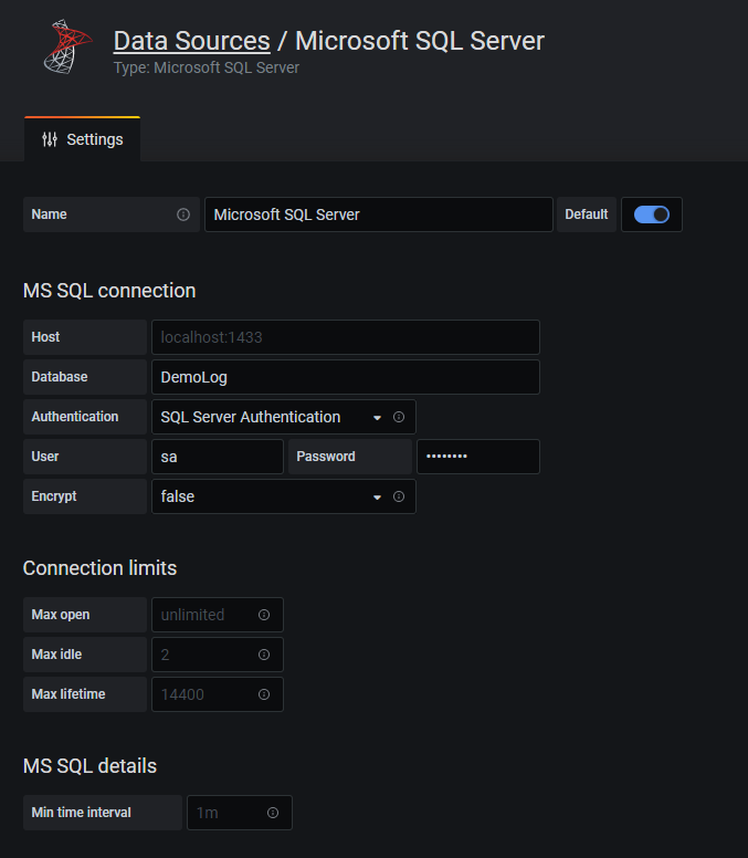
Make sure you click Save and Test to determine if Grafana will be able to communicate with your database.
Step 3: Set up a Graph
Now it is time to visualize the data being logged by OAS. Either on a new or existing dashboard in Grafana, add a new Panel.
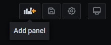
Click “Add Panel” to begin editing the newly placed panel. By default this will be a line graph which is perfect for displaying the data we’re logging. For each data point, add a series. The SQL query to use for the Sine Tag data is:
SELECT
  $__timeEpoch(DateAndTime),
  Sine_Value as value,
  'Sine' as metric
FROM
  LogData
WHERE
  $__timeFilter(DateAndTime)
ORDER BY
  DateAndTime ASC
You can add the other series, modifying this query to change Sine_Value to Random_Value, or Ramp_Value, making sure to change the string ‘Sine’ used for the label to either ‘Random’ or ‘Ramp’.
Your queries should now look something like this:
You should also see data being plotted on the chart above the queries. If not, change the timeframe to “Last 12 Hours” and your graph should look something like this:
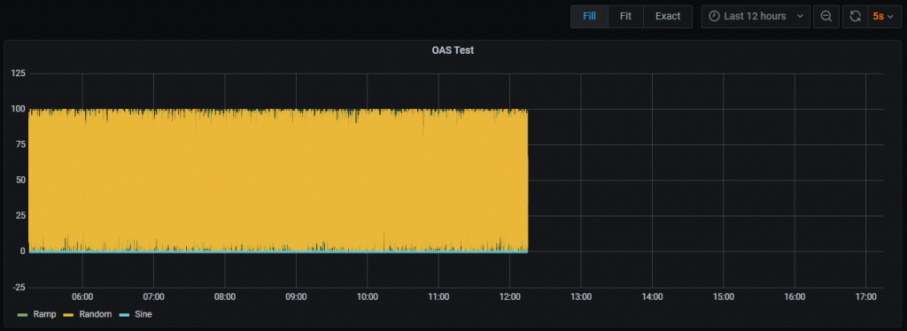
The location of the data will be in a different location on the time scale depending on the time zone you’re in. Grafana is assuming data is in UTC format and will shift the display of the data. By default, OAS will log data to a database using the timestamp of the server. For example, if you’re on the East Coast of the US, and you log a time of 5:00pm, that will go into the database with no timezone information. You can choose to store UTC timestamps by using the OAS Configuration app and selecting Configure > Options, then under the Time tab, select Use UTC Timestamp.
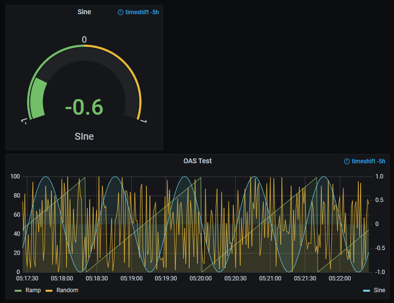
If you want to retain local time in your database, you can opt to just shift the time in Grafana. Expand Query Options and you should see several options for modifying the queries. In this example we needed to shift the time by 5 hours, so in the Time Shift field we enter 5h. Because there are so many data points, we can limit the display to the last 5 minutes resulting in something like this:
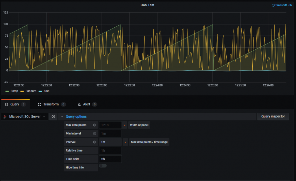
Notice how the Ramp and Random values are displaying fine, but the Sine value is only at the bottom of the graph. That’s because Ramp and Random have a range between 0 and 100, whereas Sine fluctuates between -1 and 1. To scale the Sine up to match the others, we’ll use a second Y-Axis.
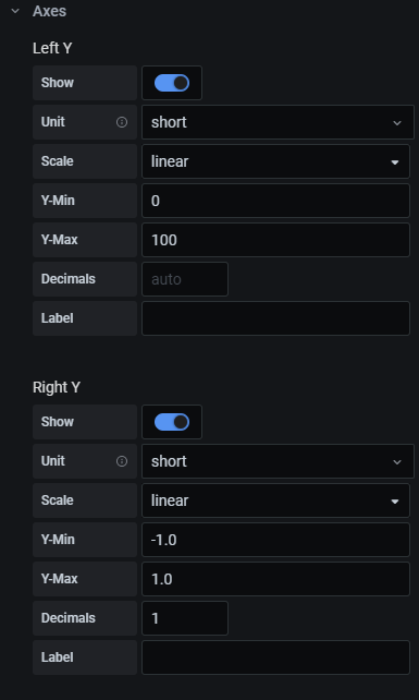
In the Grafana Panel settings on the right side of the screen, scroll down and expand the Axes section. Modify it with the following settings for left and right Y-axes:
Next, in the graph itself, locate the legend and click on the color bar next to the Sine label. This will open up options to change the series’ color as well as its axis alignment.
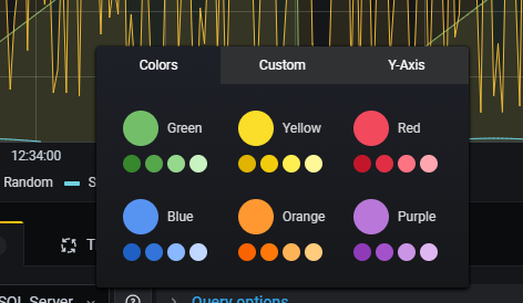
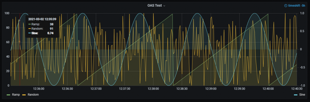
Switch to the Y-Axis tab and select “Use right y-axis”. This will move the legend for the Sine value to the right and scale the values in the display. The result will look like this:
You can now hit Apply and your panel is ready to be scaled and positioned on the dashboard. You can also explore the data, changing time frames, zooming into sections, and even automatically refresh on an interval using the Grafana UI.
Step 4: Set up a Gauge
You can also set up a panel that displays the last good value for a tag in a gauge, which can be useful for quickly monitoring systems. The configuration is very similar to the previous graph example but will contain only a single SQL query.
First, on your dashboard, add a new panel. When you are in the panel editing screen, go to the Visualization settings on the right and choose Gauge.

Now enter the following in your SQL query. This is the same query that you entered before to get the full time series for the Sine Tag. While this would appear to query the entire table, for gauges Grafana applies a filter by default that grabs the last non-null value.
SELECT
  $__timeEpoch(DateAndTime),
  Sine_Value as value,
  'Sine' as metric
FROM
  LogData
WHERE
  $__timeFilter(DateAndTime)
ORDER BY
  DateAndTime ASC
If you see “No Data”, you can apply the same time shift that we used in the previous example. If everything is configured correctly, you should see something like this:
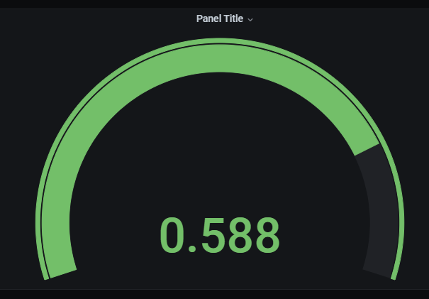
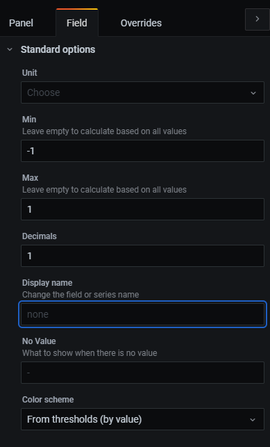
We can customize this gauge by setting the panel title as well as the minimum/maximum values.
The latter is done in the Field tab under Standard Options. For the Sine value you can enter -1 and 1 for min and max values.
And finally, you can add a Threshold value of 0 so the color of the gauge changes when the value goes from negative to positive. The end result will look like this when placed on your dashboard.
Step 5: Display Custom HMIs
Grafana is a great tool for visualizing data coming from a database. But technically this is not real time data. However, the OAS platform provides access to real time data that is coming directly from the data source (PLCs, devices, applications, etc.) without the delay of hitting a database first.
Using the OAS Web HMI, Web Alarm, and Web Trend products, you can create web pages that display this real time data. You can also create true HMIs that allow the user to interact with the data, send messages to the systems, controlling them from within a dashboard.
Grafana is not designed to be an HMI, but because of the various extensions and plug-ins available, you can combine an OAS Web HMI with a Grafana dashboard. For this example we’ll be using the Ajax panel.
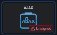
As we’ve already done, add another panel and in the visualization select AJAX. If this does not appear in your list, you can go to the configuration screen of your Grafana installation and search for plugins to install.
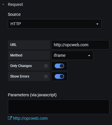
This plugin lets you embed a web page within your dashboard. To demonstrate how we can embed an OAS Web HMI page, we’ll be pointing the plugin to the OAS demo site http://opcweb.com.
In the Request panel of the configuration screen, enter http://opcweb.com for the URL, IFrame for the method and remove all of the text in the parameters field. Also, be sure to check “only changes” so the page will not reload unless you make changes to the parameters. Your entry should look like this:
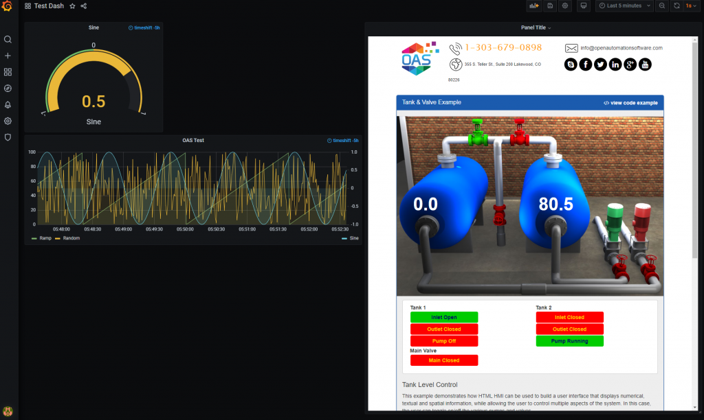
Then, when placed on your dashboard, the panel will contain a fully interactive HMI alongside your database-driven metrics.
For more information on how to develop an HMI using the OAS web tools and APIs, see the following Knowledge Base articles.