Editor Basics
The Editor contains many elements for managing and designing your projects. Each section is broken down below.
Top Nav
Along with application branding (customizable), the top navigation contains the currently selected Screen's title, screen editing tools, and the documentation search field. When a screen is selected in the Project Navigator, editing tools will be displayed and active depending on which mode you are currently in. The search field will be displayed in all modes.
Run Mode
| icon | action | description |
|---|---|---|
| Share Screen | Copies the current Screen's URL to your clipboard for sharing. | |
| Configure Screen | This allows you to set screen-level options such as background color and title. | |
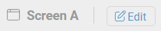
| Edit | Toggle Edit Mode | Enables Edit Mode for manipulating components and layout. |
Edit Mode
| icon | action | description |
|---|---|---|
| Share Screen | Copies the current Screen's URL to your clipboard for sharing. | |
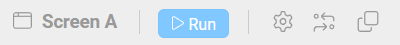
| Run | Toggle Run Mode | Enables Run Mode, exiting Edit Mode and displaying any real time data driven behaviors |
| Configure Screen | This allows you to set screen-level options such as background color and title | |
| Toggle Connector Mode | Enables Connect Mode, for drawing dynamic connectors between components | |
| Duplicate Screen | Create a copy of the current screen with all settings and components as well |
When a single component is selected, positioning tools are activated:
| icon | action | description |
|---|---|---|
| Move Forward | Move the current component one layer forward | |
| Move Back | Move the current component one layer back | |
| Move to Front | Move the current component to the front | |
| Move to Back | Move the current component to the back |
When a multiple components are selected, positioning tools are activated:
| icon | action | description |
|---|---|---|
| Align Top | Align all components along the top edge of the group | |
| Align Vertical Center | Align all components along the vertical center of the group | |
| Align Bottom | Align all components along the bottom edge of the group | |
| Align Left | Align all components along the left edge of the group | |
| Align Horizontal Center | Align all components along the horizontal center of the group | |
| Align Right | Align all components along the right edge of the group |
Grid Snap control
| icon | action | description |
|---|---|---|
| Toggle Snap | Toggles grid snapping while dragging and rotating Components. Additional input fields are used to control movement and rotation snapping distances. | |
| Snap Distance | This value determines the horizontal/vertical grid size for snapping while moving or resizing a Component | |
| Snap Angle | This value determines the angle of rotation for snapping while rotating a Component |
Connector Mode
While in Connector Mode, you can draw and reposition dynamic connectors between components.
To exit Connector Mode, just click the icon again.
Admin Tools
The Admin tools are displayed in the side bar and provide access to application configuration.
| icon | action | description |
|---|---|---|
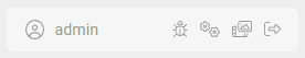
| User Preferences | At any time, you can click on the username and change your Help settings, to disable/enable the Guided Tour and Context Help. | |
| Debug Log | Open the debugging tool to record the system event log which can be sent to support for further investigation | |
| App Options | Used to configure the application, export/import configurations, and to set project security | |
| Media Browser | Opens the Media Browser for managing external media files and symbols | |
| Log Out | End the current session and return to the login screen |
Project Navigator
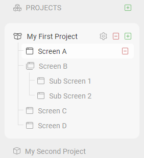
Browse existing Projects and Screens, or add Projects and Screens to the app configuration. Only users with Edit permissions on a project and screen will have access to the Project Nav. Users with Operator permissions will not see the Project Nav and left-hand sidebar.
TIP
Dragging screens under others allows you to create screen hierarchies, which are useful for organizing information and driving the Breadcrumb Component.
Screen Layout
This is where screen components are arranged. During edit mode, a helpful grid is displayed to assist with manual alignment of Components.
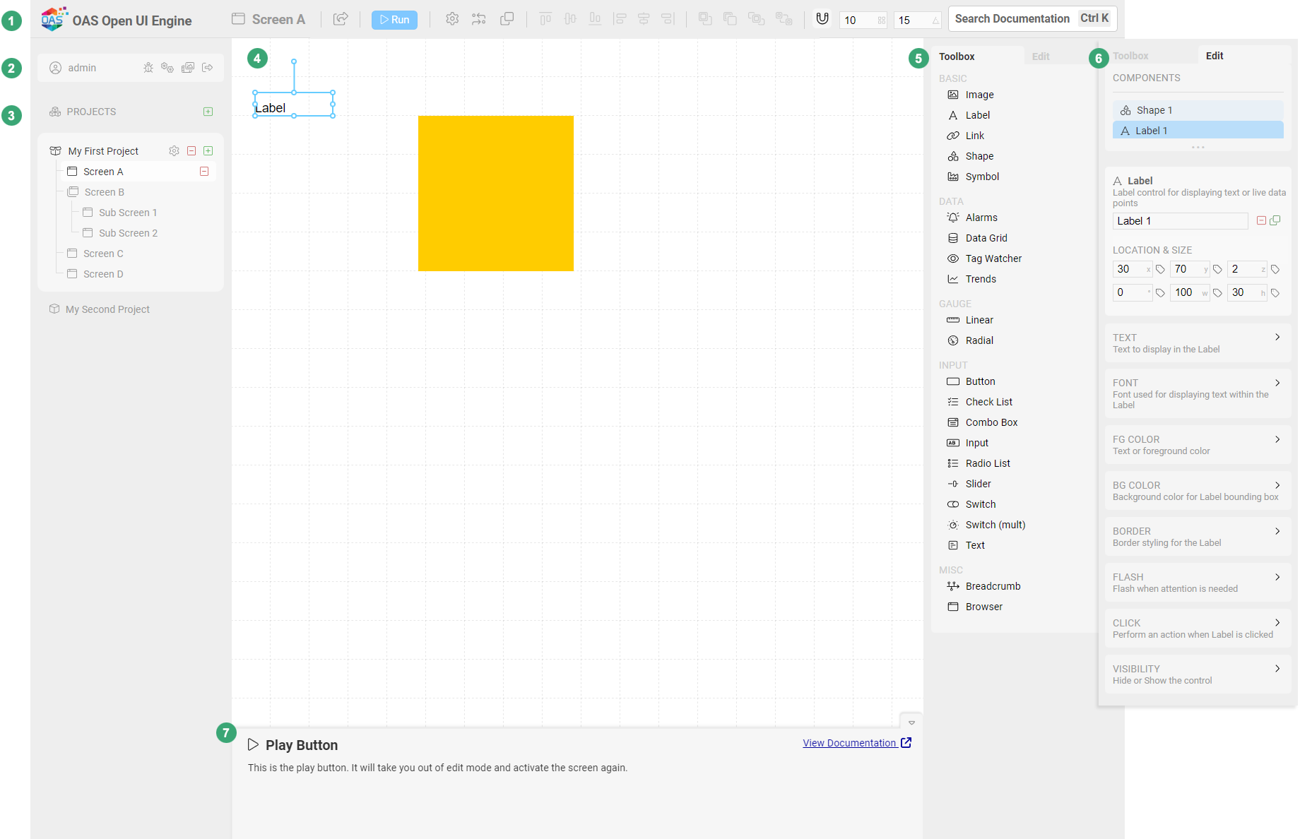
Component Toolbox
A list of Components to choose from. This will only be displayed in Edit Mode, and not while Connector Mode is active. Editors can click or drag components onto a Screen to add them to a layout.
Component Editor
Clicking the Edit tab in the Toolbox will display all of the configurable parameters of the currently selected Component. Clicking each parameter will expand additional settings for each.
Context Help
While visible, the Context Help will display descriptions and tips for using the tool you hover over. This is a good way to quickly find your way around the interface. You can always minimize this by clicking the icon once you are more comfortable with the application.