Screen Tools
The following are common configuration tools that affect the behavior of the Screen and Components placed on the Screen.
Screen Configuration
Edit the Screen configuration by clicking the icon in the Nav Bar
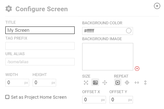
From this screen you can edit the Screen title, set the background, assign a default Tag Prefix and a URL Alias.
| Property | Description |
|---|---|
| Title | The Screen title that is displayed in the header |
| Tag Prefix | Used to simplify OAS Tag assignment and create dynamic Screen data |
| URL Alias | A user-friendly URL that points to the screen |
| Width/Height | Sets a fixed size for the screen |
| Background Color | Sets a color that fills the Screen background |
| Background Image | Uses an image for the Screen background and can be combined with the Background Color |
| Size | Method to use for sizing the Background Image |
| Repeat | Optional repeat rules for the Background Image for tiling |
| Offset | X and Y offset for fine tuning the placement of the Background Image |
| Set as Project Home Screen | Marks this Screen as the project Home. See below for details |
Tag Prefix
When any Component has a property bound to an OAS Tag property, by default the tag path and name will be explicitly set. In some implementations, or for convenience, you may want to make the Tag relative to a certain hierarchy. For example, take a server Tag structure organized as follows:
- Tag Group A
- Sub Group X
- Tag M
- Sub Group Y
- Tag M
- Sub Group X
- Tag Group B
- Sub Group X
- Tag M
- Sub Group Y
- Tag M
- Sub Group X
On the property, you can bind to Tag M.Value and then set the Screen's Tag Prefix to Tag Group A.Sub Group Y.. The result will use the data from the combined path of Tag Group A.Sub Group Y.Tag M.Value.
Later, if you want the same screen to display data from a different location in the Tag hierarchy, you do not have to re-bind all of the Component properties. You can just set the screen Tag Prefix to something like Tag Group B.Sub Group X. and the rest will follow.
URL Alias
Every Screen has a unique identifier and URL generated by the system. When navigating within the application, this works perfectly fine. When you want to share a screen URL, you can also create a custom Alias that is easier to remember. For example, if the system generated URL is:
http://localhost:58725/app/uiengine/dash/XXX123AB/8E2UUU7H
...setting the Alias to /systemstats will allow you to go directly to the Screen from the URL:
http://localhost:58725/app/uiengine/systemstats
WARNING
The example above uses localhost, but you should replace this with your own server address -- either an IP address or DNS entry, if one is configured.
The first section within the URL /app/uiengine/ is required and your alias should be appended to it.
If this is omitted, the result will be a 404 error.
Width/Height
Setting the Width and/or Height to anything greater than 0 will size the Screen container to those dimensions. This is very useful for setting a fixed resolution for target devices, especially when viewing the Screen in Public Mode.
Background Color/Image
The Background Color and Image can be combined to set the style of the Screen Background where Components are placed. The Color is a basic HTML color fill.
Once you select a Background Image from the Media Library, you can apply additional parameters for sizing and positioning it.
| Parameter | Description |
|---|---|
| Size | Original Size uses the image's dimensions. Stretch to Fit will resize the image to match the Screen size, distorting the image if the Screen and image aspect ratios differ. Scale to Fit will resize the image to fill the Screen size, keeping the original image's aspect ratio. |
| Repeat | No Repeat will only display a single instance of the image. Repeat Both will tile the image in both X and Y dimensions. Horizontal will tile the image on the X axis only. Vertical will tile the image on the Y axis only. |
| Offset | Positions the background image offset from the upper left of the screen. |
Project Home
Setting a Screen has the Project Home has the following effects:
- Marking a screen as the Home will change the default icon to in both the screen header as well as in the project hierarchy for quickly identifying it.
- If another Screen was previously marked as the Home, this designation will be removed. Only one Screen in each Project can be the Home.
- When any user logs in, they will be directed to this Screen if they have access to it. If not, the default behavior will be used, directing them to the last Screen they viewed in that browser.
- This Screen can be used as a navigation target using an event handler such as the Click on a Button or Link by selecting the Go Home option. If another screen is designated as the Home, the event handler will automatically route to whichever Screen is marked as Home. If no Screen is the Home within the project, the event will be ignored.
WARNING
If you have multiple Projects in your UIEngine configuration, and each has a Home screen designated, users logging in will be directed to the first one located in the hierarchy. For deployment of an application, this is usually not an issue as only one Project will be used on a production server. Additionally, if a user only has access to screens within a single project they will be directed to the Home Screen in that Project.
Edit Mode
In the Nav Bar clicking the icon will toggle the Screen into Edit Mode and will display the icon, which will return to Run Mode when clicked again.
TIP
In Edit Mode, all live data from OAS Tags will be suspended and the Screen will display a grid, also indicating which mode you're in.
After editing Component properties bound to OAS Tags, new settings will be picked up when you return to Run Mode and will be applied.
Connector Mode
Connector mode is used for drawing dynamic Connectors between Components. You cannot edit Component properties while in Connector mode, nor can you edit Connectors while in Run or Edit Modes.
To Activate Connector Mode, enter Edit Mode and then click the Icon. As a visual indicator, the icon will highlight, and all components will be highlighted in blue, showing where Connectors can be placed. Learn more about Connectors
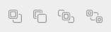
Arrangement / Alignment
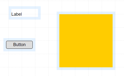
By default, every newly added Component will be on a layer above any previously placed Components. In this way you can overlap Components and even visually combine them. For example, you can place a rectangular Shape Component behind a set of Labels and Buttons to have them appear as a single unit. There may be cases when you want to move a Component forward or backward in the order, so they appear above or behind others. Use the Arrangement Tools to do this.
NOTE: these tools are only active when a single Component is selected.
| icon | action | description |
|---|---|---|
| Move Forward | Move the current component one layer forward | |
| Move Back | Move the current component one layer back | |
| Move to Front | Move the current component to the front | |
| Move to Back | Move the current component to the back |
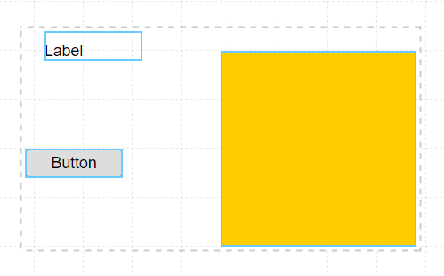
After placing multiple Components on a Screen you may want to align them to each other. You can do this by selecting all of the components you want to align and then use the Alignment Tools which will activate only when more than one Component is selected. To select multiples, draw a bounding box around the Components to align, each highlighting when then they are within the box.

| icon | action | description |
|---|---|---|
| Align Top | Align all components along the top edge of the group | |
| Align Vertical Center | Align all components along the vertical center of the group | |
| Align Bottom | Align all components along the bottom edge of the group | |
| Align Left | Align all components along the left edge of the group | |
| Align Horizontal Center | Align all components along the | |
| Align Right | Align all components along the right edge of the group |
Grid Snap control
By default, as you drag, resize, or rotate Components, they move in increments determined by the Grid Snap settings. These can be disabled for precision positioning, as well as adjusted to your preferences.
| icon | action | description |
|---|---|---|
| Toggle Snap | Toggles grid snapping while dragging and rotating Components. Additional input fields are used to control movement and rotation snapping distances. | |
| Snap Distance | This value determines the horizontal/vertical grid size for snapping while moving or resizing a Component | |
| Snap Angle | This value determines the angle of rotation for snapping while rotating a Component |
Component Grouping
At times you may want to group multiple Components together so they can always be positioned relative to each other, without needing to move each one independently. This is especially useful when replicating copies of these groupings in your layout.
Grouping
To create a Component Group select multiple components and use the common CTRL-G keyboard shortcut. The components will now be grouped and in Edit Mode will be indicated by a striped overlay. You can reposition the group and it will behave as a single Component. This means it can be copied, pasted, and selected like others.
Editing Components in a group
However if you want to edit any of the underlying properties of a Component within the group, hold CTRL-OPTION or CTRL-ALT and all group overlays will be hidden, allowing you to click on a single component to edit it. You can reposition, resize, and rotate a child Component as well, and the group container will adjust accordingly.
Ungrouping
To ungroup Components in a Group, click the group to select it and it will be highlighted. Then click CTRL-U and the components will be released from the Group.