Slider
Sliders can be used to give the user a range of choices to pick from, either as a smooth analog style slider, or as an index slider that lets a user select an option for a ranged list.
 )
)
Properties
| Property | Type | Description |
|---|---|---|
| Options | Options | Configures the slider properties and layout |
| Label Font | Font | Font style used for the text labels on the slider |
| Primary Color | Color | Track and value color |
| Label Color | Color | Color of labels on the track |
| Slider Fill | Color | Inside color of the slider |
| Slider Border | Color | Border color of the slider |
| BG Color | Color | Background or fill color behind the slider |
| Border | Border | Optional border around the Component |
| Enabled | Boolan | Enables or disables the item - only used to control when the Change event is active |
| Visibility | Boolean | Determines when to show or hide the component |
| Change | Event | Handles the event when the slider value changes |
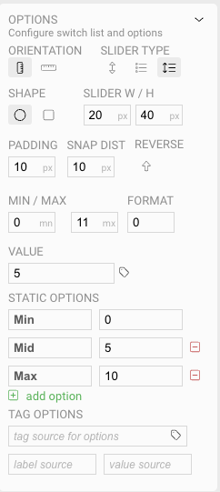
Options
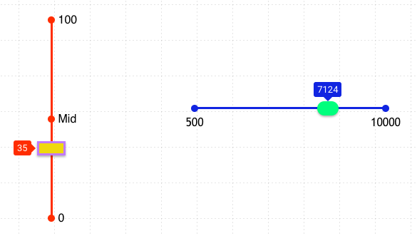
There are three slider types, a range slider, an index slider, and a combined range / index slider. All three look similar, but allow for different use cases.
- Use a range slider when the user can select any value within the range
- Use an index slider when the user can select a specific value within a set of values
- Use the combined slider to give the user options on what to select, but to allow values to be selected between those options.
- All sliders can be oriented in a vertical or horizontal position.
Each type of slider has slightly different configuration for the options it presents.
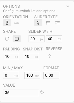
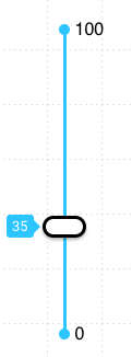
In the simplest form, a range slider simply takes the minimum and maximum values the slider represents. The Format field controls how many decimal places are shown on the slider, to allow for varying degrees of accuracy. The Value field will set the initial value of the control at run-time.
Like all controls, a Tag may be selected to display the value of the Tag on the control.
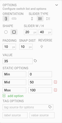
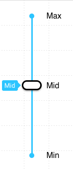
An index slider works similarly to other option inputs, such as the Check List or Combo Box You provide a series of options to indicate the choices a user has when manipulating the slider. In this example, there are three options set, along with a value for each.
Like the other option inputs, the list of options can be determined from a Tag value on the server.
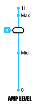
Finally, a combined slider includes both options, so that you can set a minimum and maximum value, along with index points along the track. As you can see in the example, the Min and Max ranges also act as additional indexes along with the stops added as options in between.