Radial Gauge
Displays a numeric value in a customizable radial gauge.
Properties
| Property | Type | Description |
|---|---|---|
| Gauge Options | Gauge Options | Configure parameters that control the appearance of the gauge |
| Value | Numeric | Set a static or dynamic value bound to an OAS Tag |
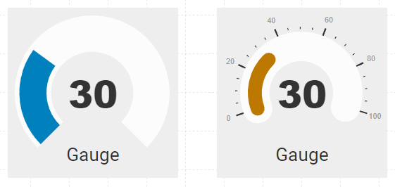
| Value Color | Color | The fill color that indicates the current value |
| Value Font | Font | The font used for the label that displays the current numeric value |
| Label | String | The static label displayed on the gauge |
| Label Font | Font | The font used for the text label on the gauge |
| BG Color | Color | Background or fill color behind the component |
| Border | Border | Optional border around the Component |
| Text Color | Color | The color used for both the numeric value and label text |
| Visibility | Boolean | Determines when to show or hide the Component |
| Flash | Boolean | Causes the Component to flash, drawing attention to it |
Gauge Options
Options for customizing the appearance of the gauge
| Option | Description |
|---|---|
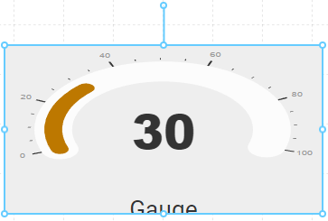
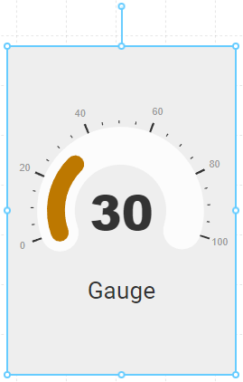
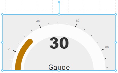
| Sizing | Determines the way the gauge is sized within the Component. Stretch - changes the shape of the gauge according to the component dimensions Fit - fits the gauge within the Component bounds, without distorting the gauge dimensions Fill - fills the gauge to the extents of the Component, even if some edges get cropped |
| Padding | In pixels, the padding between the gauge and the Component edge |
| Alignment | Allows you to position the gauge within the component both horizontally and vertically |
| Direction | The direction in which the value fills the gauge. By default, the gauge will fill in a clockwise direction , but can be reversed to fill in a counter-clockwise direction |
| Value Min/Max | The numeric minimum and maximum represented on the gauge and used to determine the value fill percentage |
| Start/Arc | The Start and Arc are expressed in degrees from 0-360. Start indicates where the starting value is placed, and Arc indicates how many degrees the full radial gauge will fill. A value of 180 is a half-circle, and 360 is a fully circular gauge. |
| Endcap | The gauge shape can use either a flat or rounded endcap. 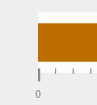 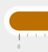 |
| Width/Pad/BG | Controls the width of the value fill, the background padding around it, and the background padding color 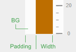 |
| Value Format/Units | You can use a numeric formatting string to determine how the value label will display the current value. For example, if you want to round a floating point value of 3.14159 to two decimal places, you can use 0.00 as the format to display in 3.14. The optional Units field is a string to append to the value, so entering a string of psi will display 3.14 psi. |
| Tick Count | Sets the number of Ticks, both major and minor, when Tick Location is not set to none. Major Ticks are rendered based on a the value range. For example, if the Min and Max are set to 0 and 100, and the Major Ticks is set to 6, you will see one tick every 20 steps. 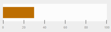 Minor Ticks are the number of ticks between Major Ticks. For example, setting Minor Ticks to 3 in the example above will indicate value increments of 5 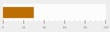 |
| Tick Location | Ticks can be placed on the outside, inside or center of the value fill. Setting Tick Location to none will hide the ticks. |
| Tick Color | The color used for the Tick lines |
| Tick Size | Independently set the length of both Major and Minor Tick lines |
| Numerals | Similar to Tick Location, you can choose to place the numeric labels that appear in the Major Tick position where you prefer. |
| Numeral Color/Format | The color of the numeric labels and numeric format to apply, similar to the Value Format |