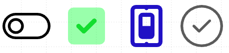
Switch(Simple)
A simple toggle switch that allows a user to choose between an "on" or an "off" value.
Properties
| Property | Type | Description |
|---|---|---|
| Options | Options | Configures the switch type and values |
| FG Color | Color | Foreground / primary color of the switch |
| Secondary Color | Color | Secondary color of the switch, if it supports a second color |
| BG Color | Color | Background or fill color behind the switch |
| Border | Border | Optional border around the component |
| Enabled | Boolan | Enables or disables the item - only used to control when the Change event is active |
| Visibility | Boolean | Determines when to show or hide the component |
| Change | Event | Handles the event when the switch value changes |
Options
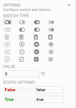
Within the Switch options you can:
- Set the style of the switch. Note that the last column of switches have a Secondary Color option for additional styling needs
- Set the initial value of the control: 0 = false or off, 1 = true or on
- Set the data values for the control when it is in the on or off position. This value can then be used when handling the Change event.