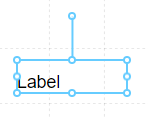
Label
A label is a basic screen element that is used to display static text or, with the help of tags, dynamic text based on server data.
Properties
| Property | Type | Description |
|---|---|---|
| Text | Text Options | Text to display in the Label |
| Font | Font | Font style used for the Label |
| FG Color | Color | Foreground Text color |
| BG Color | Color | Background color behind the Text |
| Border | Border | Border around the Label |
| Visibility | Boolean | Determines when to show or hide the Label |
| Flash | Boolean | Causes the Component to flash, drawing attention to it |
| Click | Event | Handles a click event |
Text Options
Typically Labels are used to display static text information on the screen, such as header text for a Screen, or to identify a specific item or area on the Screen. However, using the Tag Browser, you can apply a Tag value to a specific label, and have it update in real-time.
Refer to the Tag Browser documentation to learn how to search and apply tags to the text Label.