Creating an effective and usable UI takes a combination of many elements. It involves displaying data, providing instructions for users in the form of labels and even positioning of components to indicate how bits of data relate to each other, and even requires using color to highlight important pieces of information. No user interface is perfect, but when you have a rich toolbox to work from, your chance of succeeding is increased.
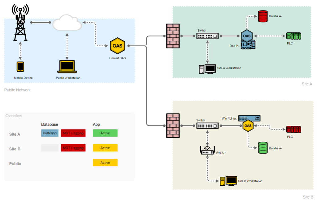
Take the example here, which is a representation of a working multi-tenant network deployment of OAS systems, performing data logging and communication with PLCs for operational data. Shapes are used to group regions together, and symbol colors indicate their status. Labels are arranged in a tabular format to help the user see the current conditions of the system as a whole.
All of these tools and more are at your fingertips within the UIEngine screen editor. Below is a comprehensive list of every visual component included in the platform.
When you’re ready to try the OAS UIEngine, download a free 30-day trial of the OAS Platform, with all features enabled.
Also, take a look at the full UIEngine Documentation, to learn more about each of these components.
Basic & Navigation Components
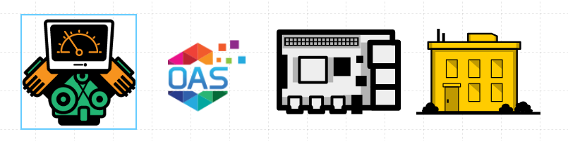
Images and Symbols
Used for displaying static or dynamic graphics on a Screen. With Image and Symbol customization options you can control properties such as scaling and tiling behaviors, and even change which graphic is displayed based on live OAS Tag values. Images can be any format that can be displayed in a web browser, including .png, .jpg, .gif, .webp, and .svg. Symbols exclusively use .svg files to retain fidelity at any resolution.
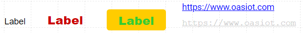
Labels & Links
The Label is a simple text label that can display static or dynamic text. The Label is probably the simplest component, but still benefits from all of the power of the UIEngine, which means it can be fully customized and updated from live data. It can even act as a button, responding to user clicks. The Link component is similar to the Label, but appears as a hyperlink and is typically used for navigation within your application or to external web pages.
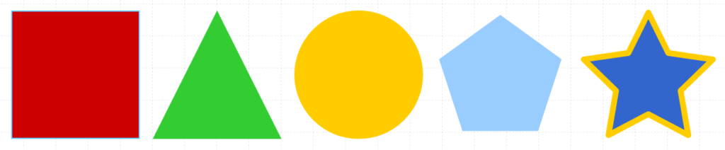
Shapes
The Shape component lets you place geometric shapes such as circles, squares, or polygons on a screen that can help you provide structure or graphical elements to your layout. Like all UIEngine components, the Shape can be static or have many of its properties driven by OAS Tag data. Combine and overlay shapes to create complex designs or active indicators on your screen.
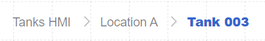
Breadcrumb
The Breadcrumb displays a dynamic menu based on screen and sub-screen hierarchy, allowing users to easily navigate between screens. Place this on every screen and a user can see where they are and how they got there. It also automatically updates if you change the hierarchy of screens in your project.
Gauges
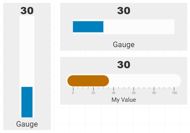
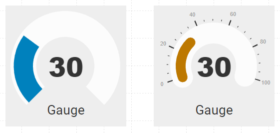
Linear and Radial Gauge
These components allow you to display a live graphical representation of your numeric data for evaluating your running systems at a glance. They are both highly customizable, including properties for sizing, positioning, colors, value scales, as well as number and position of ticks between each major value. Linear Gauges move horizontally or vertically, and Radial Gauges have a circular sweeping action.
Data Components
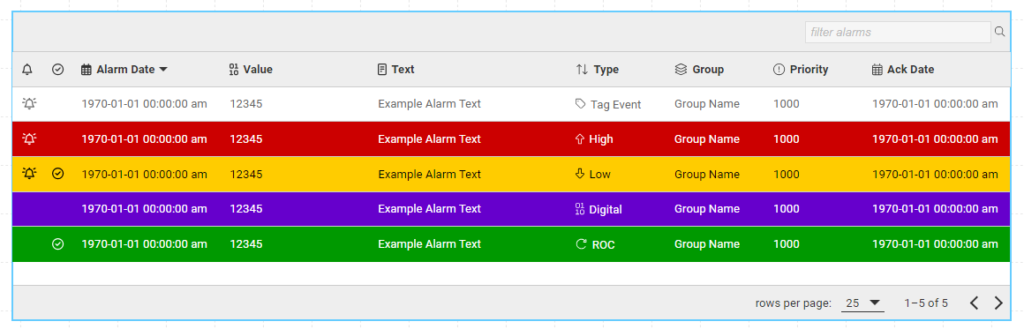
Alarms
Display and manage OAS Alarms in a tabular view. With this component, you have a live window into your processes and can respond to critical events. The Alarm component displays real time and historical alarms in an interactive table allowing operators to filter, sort, acknowledge and even comment on alarms as they occur.
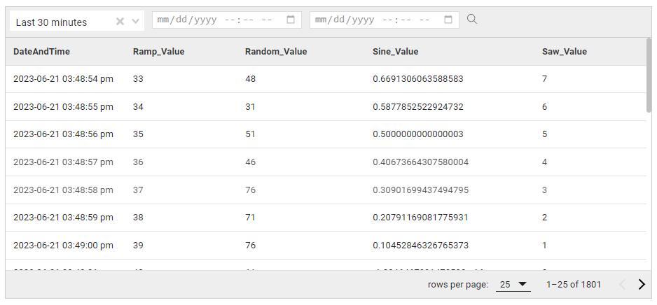
Data Grid
Load and display OAS historical data in a tabular format when logged to external databases using the OAS Data Historian feature. Filter and sort the data, and even export to .csv files for offline analysis. The Data Grid is customizable and fully integrated with the OAS Data Historian. Select a predefined data logging group, columns to display, and even a default query to perform. Users can then drill down into logged data during run time.
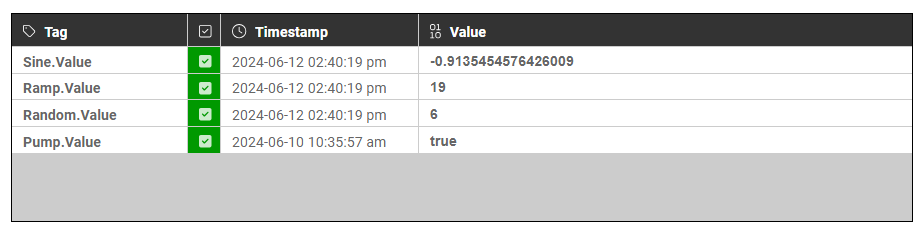
Tag Watcher
The Tag Watcher displays raw OAS Tag data for debugging and monitoring. This component is useful both in developing your interfaces as well as for end users needing to monitor real time data along with other components that use those values within properties.
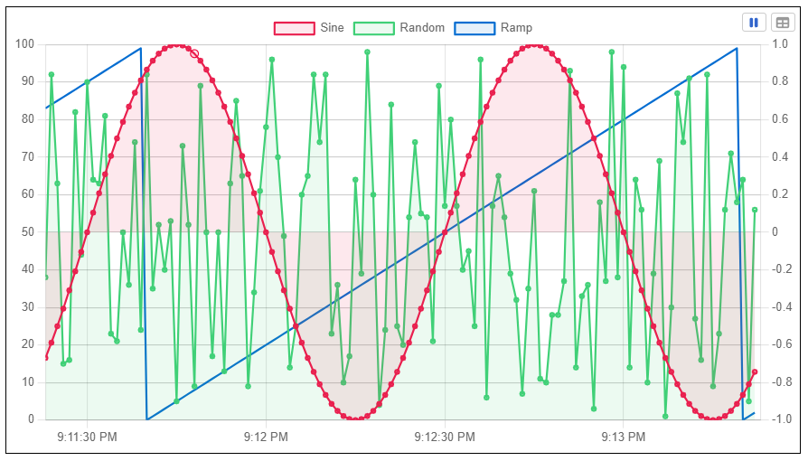
Trends
Using the Trend component, display real time and historical OAS Tag data plotted on an interactive chart. With a wide variety of customization options, you can determine the size of the sliding time series, scale, and color scheme to help with live data analysis. As with the Data Grid, you can also view raw tabular data and export to .csv.
User Input Components
Every user interface needs a good set of components that can handle user input. In an upcoming post we’ll cover more details on handling events based on user input.
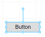
Button
A standard Button component for allowing users to click and interact with the interface, triggering an event that can update an OAS Tag value, navigate to another screen, or even update a global Tag Prefix on the current screen.
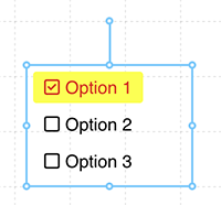
Check List
The Check List renders a series of checkboxes that a user can select and de-select one or more options, as well as display a parsed complex value containing multiple values.
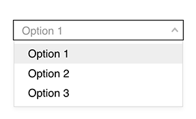
Combo Box
A standard Combo Box or dropdown style input for selecting an item from a predefined list of values.
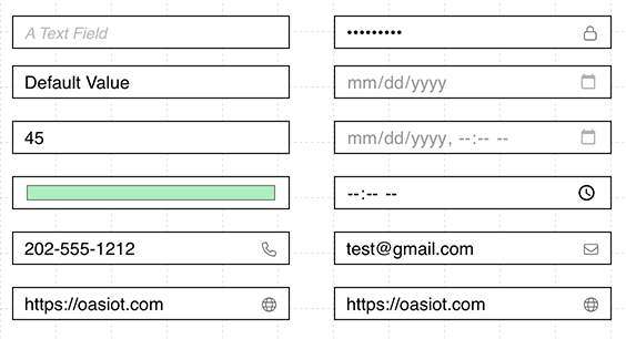
Input Field
A text Input component that can be tailored for different data types, enforcing validation rules for each type, such as strings, numbers, or email addresses.
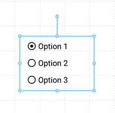
Radio List
The Radio List is a series of radio buttons that allows a user to select a single value from a visible set of options.
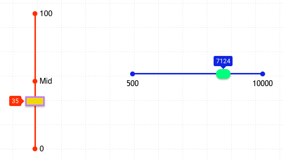
Slider
An interactive Slider style input control that outputs a value from within a range of numbers by manually dragging from one value to another.
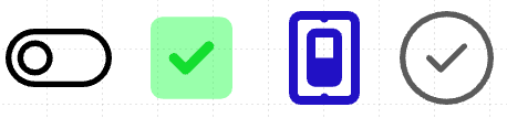
Switch (Simple)
A simple toggle Switch control, with various presentation styles and options. This is best used for reading and writing boolean values.
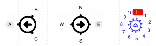
Switch (Multi)
A multi-position Switch to capture a single precise value within a range. You can predefine the number of positions and value for each position.
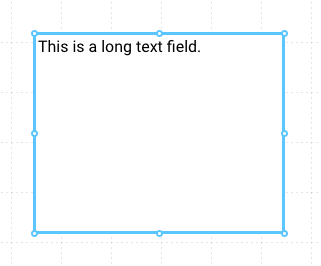
Text Field
A long-form Text input field that allows a user to enter larger strings of text.

Follow this series of UIEngine articles highlighting each of its features. There is so much more within the UIEngine and we look forward to seeing the amazing things you can build with it!
See the full UIEngine Documentation, to learn more about building no code HMIs and applications.