TL;DR:
- Industrial data visualization helps teams quickly understand production trends and spot issues before they grow.
- Real-time visuals give operators instant insight into machine performance, cycle times, and equipment health.
- Charts, dashboards, and analytics tools make complex manufacturing data easier to interpret and share.
- Strong data integration ensures accurate, consistent information flows from all systems into one view.
- Clear, reliable visuals support smarter decisions and smoother operations across the plant.
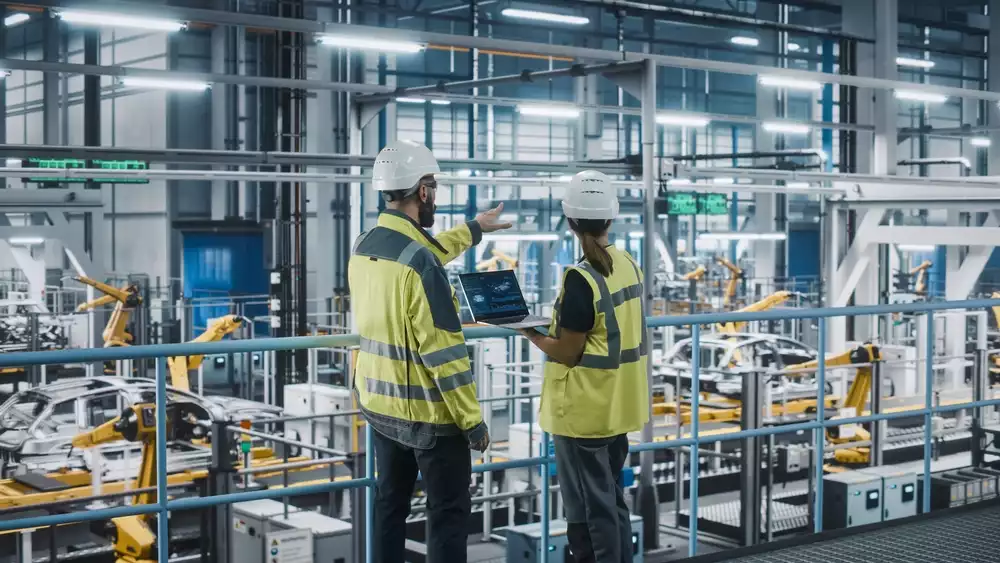
Industrial data visualization gives manufacturers a better way to understand what their machines and processes are telling them. Raw numbers alone can hide what really matters, but the right charts and dashboards make patterns and problems jump out instantly. Teams can spot slowdowns, track performance, and act faster with far less guesswork.
As production environments get more connected, the need for simple, useful visuals only grows.
In this blog, we’ll look at how industrial data visualization strengthens decision-making and which techniques help turn everyday plant data into something you can actually use.
Why Data Visualization Matters in Manufacturing
Data visualization in manufacturing helps teams quickly understand what is happening on the floor. Clear charts and dashboards turn production numbers into visuals that show trends, spot issues early, and guide better decisions. This keeps operations moving with fewer surprises.
Manufacturing data visualization also supports long-term improvements. Teams can compare performance over time, see how changes impact output, and track progress toward key goals. When data comes from many systems, visuals pull everything together so decision-makers get a complete picture of what is working and what needs attention.
Power of Real-Time Manufacturing Data Visualization
Real-time manufacturing data visualization gives teams instant insight into what’s happening across machines, lines, and processes. Live dashboards make it easier to spot shifts in cycle times, unexpected stops, or changes in quality as they occur. This allows operators to respond right away instead of waiting for reports or end-of-shift reviews.
With live data feeding directly into visual tools, teams can monitor equipment health, track production goals, and stay ahead of potential slowdowns. This helps prevent small issues from turning into costly downtime. Real-time views also support smoother collaboration, since everyone can work from the same current information.
As plants continue to rely on connected equipment and continuous data streams, the value of real-time insights grows. Immediate visibility keeps production stable, reduces guesswork, and strengthens overall decision-making.
Core Visualization Techniques & Tools
Effective industrial data visualization depends on choosing formats that match the information you want to highlight. Some of the most common and useful options include:
- Line charts: Great for tracking trends in production, quality, or equipment behavior.
- Bar charts: Help compare shifts, machines, materials, or output levels.
- Scatter plots: Useful for spotting relationships between variables.
- Heatmaps: Highlight areas of high or low activity across a process.
- Gauges and indicators: Keep key metrics visible for quick checks.
Dashboards bring these visuals together in a single view. Many teams use them to organize real-time updates, alerts, and summaries that support data visualization in the manufacturing industry. Features like filtering, drill-down views, and flexible layouts make it easy to move from a big-picture overview to meaningful details.
Analytics tools add another layer by combining historical data with current activity. This helps teams analyze performance trends, refine processes, and share clear insights across departments. When visual tools feel simple and intuitive, teams can explore information confidently and make better decisions.
Integrating Data Across the Manufacturing Industry
Effective visualization starts with bringing all manufacturing data into one reliable system, and that process involves a few key steps.
Connecting Different Data Sources
Most plants rely on PLCs, sensors, databases, and various software platforms. Pulling information from all these systems into a single, consistent view can be a challenge. Strong integration ensures the data stays accurate and up to date so teams can trust what they see.
Creating a Unified Data Flow
A unified data path keeps everything organized. When information moves through one structure, dashboards and charts load clean, reliable data instead of conflicting or incomplete readings. This helps teams react with confidence.
How Open Connectivity Helps
Tools that support open connectivity, like the approach we use at Open Automation Software, make it easier to link devices and applications across a plant. Once everything is connected, building clear visualizations becomes a smoother process. Strong integration gives teams a solid foundation for turning complex data into practical insights.
Moving Forward with Better Visualization
Manufacturers gain the most value from their data when it becomes easy to explore, share, and apply to everyday work. Strong visualization practices support this by giving teams a clearer path from raw information to practical insight. The result is a more informed, more aligned approach to running and improving operations.
If you want to start working with your automation data in a more meaningful way, try the Open Automation Software platform through our fully functional 30-day trial. It includes everything you need to connect your systems and begin creating powerful visual tools right away.