When trying to view critical diagnostic data, address an urgent alarm, or simply tweak equipment capacity to meet sudden demand, nobody wants to navigate an unorganized, visually confusing interface. Building an effective user interface is usually a time consuming task, and requires skills in web development, HTML, Javascript, and other technologies. The OAS UIEngine lets you create UIs, HMIs, and applications with zero code.
OAS Open UIEngine makes positioning and styling all of your control components as simple as possible – making it easy for anyone to build an intuitive interface for any and all of your integrated machinery.
You can control which components are available, where they are located, their styling, and behavior.
Methods for positioning Components
Drag and Drop
Click the component to select it, then drag it to a new position. You can even use keyboard shortcuts to move the component, clicking directional arrows to move up, down, left and right. Holding SHIFT will move 50px at a time and holding CTRL will move 1px at a time.
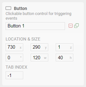
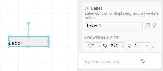
Precision placement with direct coordinates
In the component properties panel, you can enter pixel coordinates for the x, y, z, and rotation values. The x and y values position the component relative to the zero position in the top/left of the screen. The z value determines the layer position, with larger values on top. And rotation is in degrees.
Group and drag multiple components
By highlighting multiple components, a temporary group is created, allowing you to drag them all to a new position, keeping their relative positioning intact. You can also use keyboard shortcuts to position the group as if it were a single component. Click in an open area and the group is released.
Drive component positions from live OAS Tag data
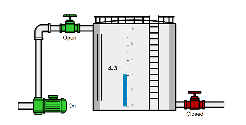
While not necessary in most cases, you also have the option to use the value of an OAS Tag to drive the position, size, and rotation of a component. This opens up the possibility of creating your own dynamic charts, gauges, or even progress bars, all based on live data from your devices.
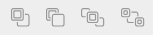
Arrange and align components multiple components
When multiple components are selected, you can use the functions in the editor toolbar to align them both vertically and horizontally.
Selecting a single component, you can use the layer positioning tools to bring it forward and moving it backward. This is extremely useful for building symbols from basic shapes, or even placing a shape behind components to add visual interest.

Component Styling
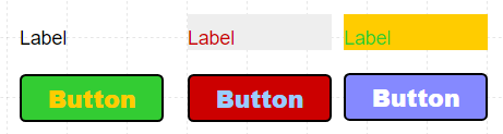
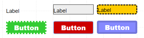
Background and Foreground Colors
Most components expose settings for Background Color, and many also have a Foreground color. Background Color will fill the entire component bounding box, while Foreground Color will apply to other elements, such as the text on a label. Colors can be any valid HTML color, including hex values, named colors (even transparent!), or using RGBA notation for mixing red, green, blue and alpha channels.
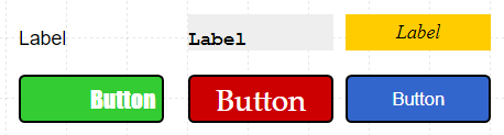
Font Styling
Components with a text element will allow you to set the font face, the size of the font in pixels, additional attributes such as bold and italic can also be applied. Font property panels include padding fields to apply individual spacing top, right, bottom, and left of the text, and text can be aligned both horizontally and vertically within the component bounds.
Border Styling
Adding a border to a component can make it stand out, or to define a visible boundary around it. You can set the border thickness, color, and style, as well as defining a corner radius for making rounded rectangles.
Visibility
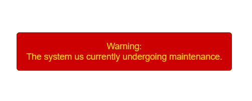
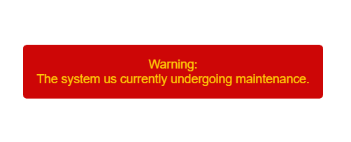
Strategically showing and hiding elements is useful for disabling functionality when your system is in a given state. For example, you can hide a “Reset” button when the system is functioning properly, but then show it when the system is undergoing maintenance. Or you can hide an alert unless an OAS Alarm state has been triggered.
Animated Flashing
Users often get accustomed to a layout and may miss important events if the changes are subtle. Applying a Flash attribute triggered by an OAS Tag can draw attention to the problem, reducing the odds of it being ignored. You can determine the rate of the animation as well as how long to continue the flashing.
Tag Binding and Cascading Logic
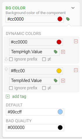
In addition to using a single value to control a single property, many properties such as color, visibility, and even images can use what we call “Cascading Logic”.
This means you can use multiple value states to trigger different styles. For example, if you have 3 OAS Boolean Tags representing medium, and high temperature states, you can set a color value (e.g. background color, text color, etc.) corresponding to each of those tags. The first tag that evaluates to true will trigger a color change. If no Tag evaluates to true, the default color will be used. You can even assign a color indicating bad data quality for when there is loss of communication to the sensor.
You can also use a single Tag and different Alarm thresholds instead, making the color binding much simpler to control. For example, modifying the Alarm threshold on the server will instantly update the UI without needing to modify the screen or component.
Follow this series of UIEngine articles highlighting each of its features. There is so much more within the UIEngine and we look forward to seeing the amazing things you can build with it!
See the full UIEngine Documentation, to learn more about building no code HMIs and applications.